10 best UK charity website examples in 2019
Charity websites primary goals are to drive donations and raise awareness of the issues they are tackling. Persuading people to give their money away is not an easy task and effective sites need to inspire the best human emotions of compassion, sympathy and admiration. Good website imagery is perhaps more critical in this sector than any other, where engaging people on an emotional level is so important. The outstanding charity sites tend to have strong video or photography and keep text to a minimum, particularly on the home page. A recent trend has seen the inclusion of bold statistics and infographics to convey the message in simple understandable terms. A bold call to action – donate, volunteer, sign up, etc, is usually prominent on every page of the site.
This is not a definitive top ten and to asses the huge number of website out there would be an enormous task, besides defining what is a great web design is always subjective. Instead, this is a cross-section of examples that demonstrate best practice. It is important to consider each site in context, large charities with big budgets can employ a design agency, professional photographers, video makers and a team to manage the site on a daily basis. Smaller charities may be working on a shoestring and have a site designed and run by just one or two people.
RLNI
With donations in the top 10 of charities in the UK, the RNLI is obviously blessed with the resources for a great online presence. They also benefit from a subject matter that is highly photogenic and does not need quite the same level of visual sensitivity as charities that deal with more traumatic personal issues. Their website is bold and beautiful with lots of updated rescue stories with accompanying pictures and video that are updated on a daily basis. There is enormous depth to the site but easy to navigate and not overwhelming. rnli.org

Great Ormond Street Hospital
The most well, known children’s charity in the UK, this site uses a short looping video as the primary image, a technique which is becoming increasingly popular. The simple but understandable tabs help join together tow related but separate sites for the hospital and the supporting charity. The site is visually led with many great photos and video of the patients throughout. Sensitively photographing sick children while projecting a positive image is a challenge that has been met and woven with inspiring stories. www.gosh.org

Water Aid
The animated counting figures to represent their three key benefits, getting your attention and makes you want to watch the film that explains their projects in more detail. The video is cleverly overlaid and indicates the scroll down to the calls to action. This site relies on video and good design to convey its most important messages all on a single home page with minimal clicks for the user. An exemplar of attention-grabbing and simplicity. www.wateraid.org/uk

Royal Navy and Royal Marines Charity
A video-based homepage showing sailors coming home to their families after a long time at sea instantly explains the human side of this charity. Bold design and a simple colour palette in harmony with the naval theme. Every effort has been made to offer simple messages, cut down text to the minimum and break it up into smaller blocks and buttons that lead you through the site. www.rnrmc.org.uk

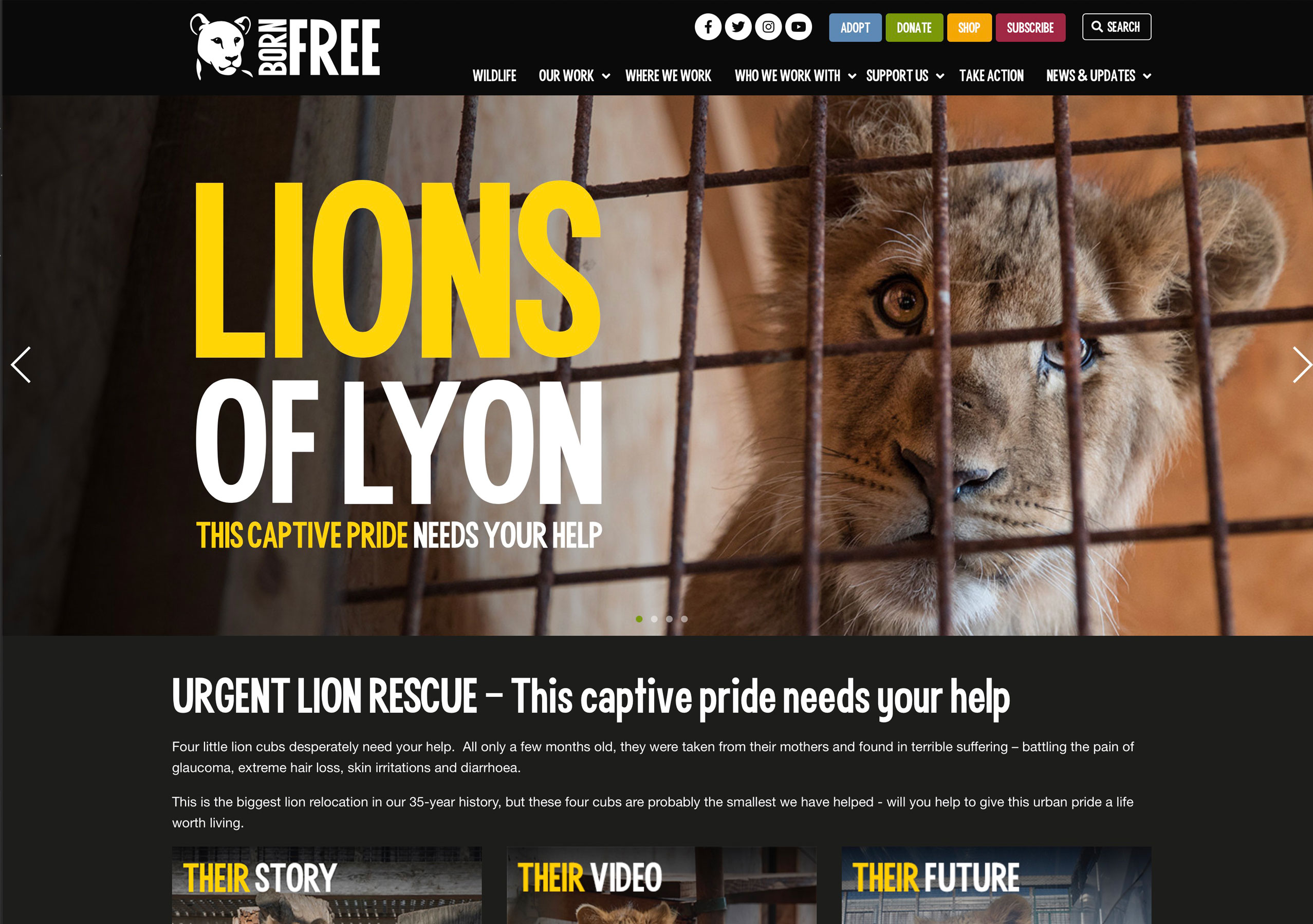
Born Free
One of the most visually arresting charity sites around, the dark design, ultra-bold typography and stunning images of wildlife make for a potent message and it’s a pleasure to visit. The slightly loose/distressed typeface, bright colours and some rougher elements help avoid a corporate feel and give the site real personality. www.bornfree.org.uk
The Message
This website for a mid-size Christian charity is slightly unusual with a home page more like a blog with a feed of posts in clearly colour-coded categories; Audio, Video, Stories, Jobs, Teaching etc. This makes their content quickly accessible and gives a feeling of freshness. Navigation is quirky with tabs with a horizontal row above for quick links, media and locations. The site uses plenty of big bold images and on pages where large amounts of text are necessary, it’s well laid out and easy to read. www.message.org.uk

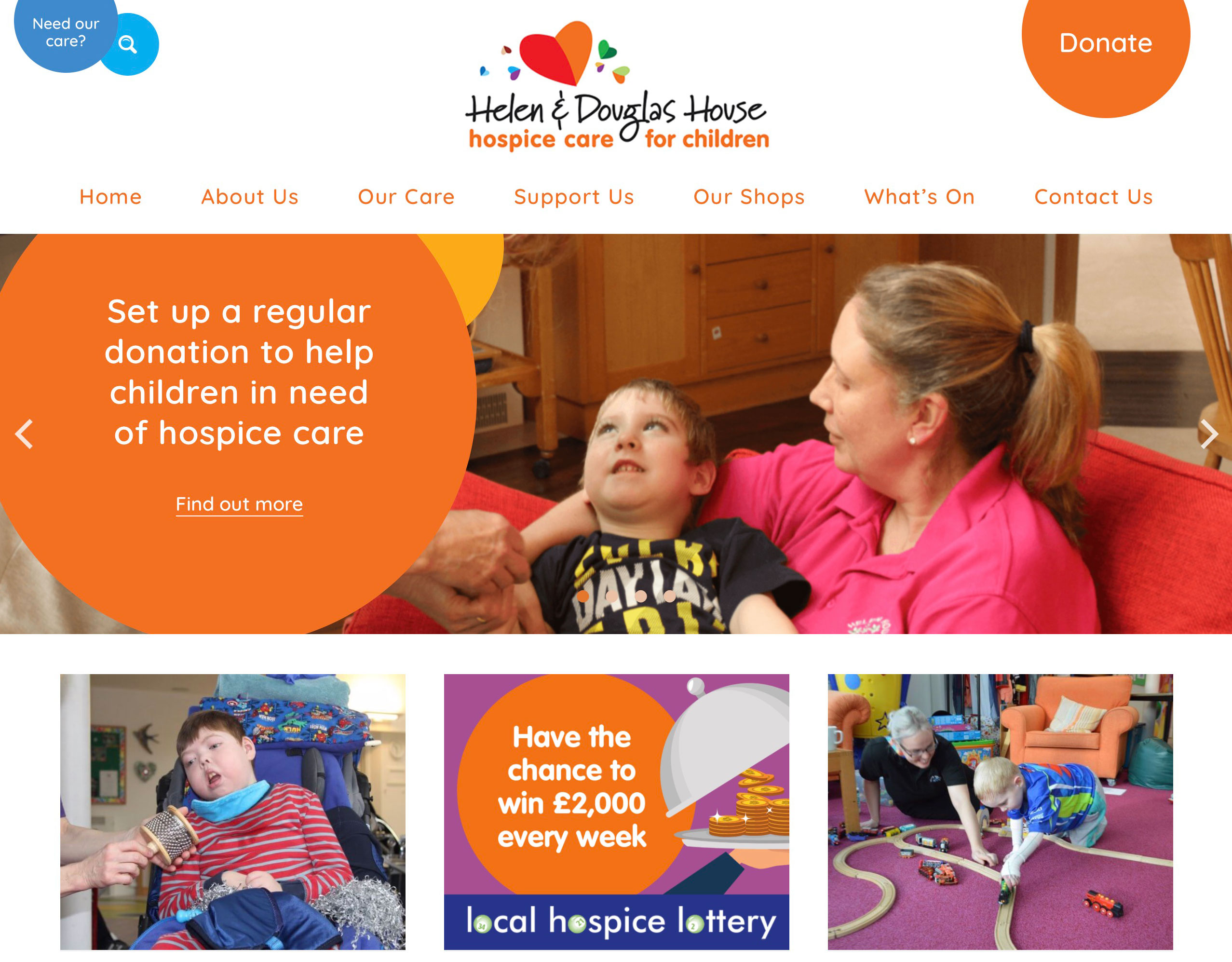
Helen Douglas House
The stories of terminally ill children are heartbreaking and presenting the work of this charity has been done sensitively but with great positivity. The difficult subject matter is helped by use of bright colours and circular theme combined with great images. The site has a soft child-like design but makes you feel this is a trustworthy organisation worthy of support. The donate ‘balloon’ remains visible anchored to the top of the screen at all times as you scroll down, a sensible way to highlight a call to action. www.helenanddouglas.org.uk
Emmaus Brighton and Hove
This is a quirky site for a small community dedicated to supporting homeless people and each other. Reflecting the informal, friendly values with an emphasis on recycling this is the opposite of the more corporate style sites of larger charities. Although it has a messy, relaxed feel, information is clear and accessible. The designer has pulled off a fine balancing act between usability and artistry that makes it fun to explore. www.emmausbrighton.co.uk

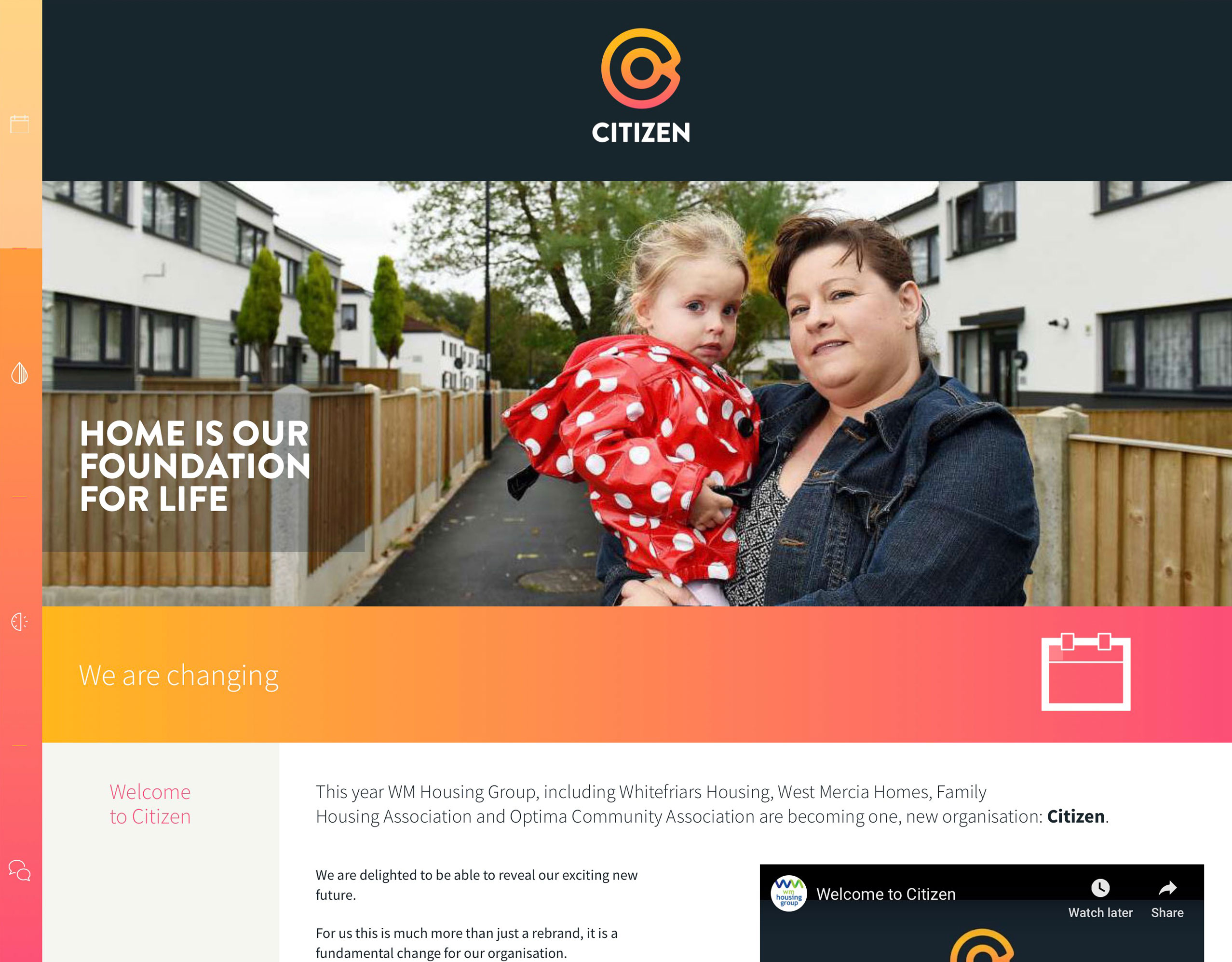
Citizen Housing
This is a small website for a not-for-profit family housing association, launching its new branding and services. This is not an appeal for donations or volunteers but presents information to its clients in an attractive way. Navigation design is unusual, a single page with icons on the left that scroll to the different sections. Strong colours and white space makes this simple to use and a quite different approach to the other examples selected for this article. www.citizenhousing.org.uk
Umbrella Brighton & Hove
As the designer of this site I must declare an interest… This site introduces a new charity helping homeless people into rented accommodation in Brighton. I worked with the client for a holistic approach to the site design that included taking the photos that are key to telling the story. With four categories of potential visitors to the site it had to be obvious where they could find information relevant to them. www.umbrellabh.org.uk

If you work for a charity and need help or advice about developing your website, then please get in touch.

